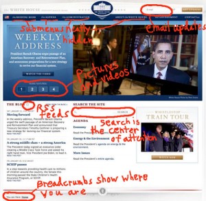
 It was interesting to turn to the Ideas section of today’s Boston Globe where freelance writer, Matthew Battles, compared the Obama and Bush administration’s design of the WHITEHOUSE.gov website, Extreme Makeover WHITEHOUSE.GOV EDITION. My last blog entry on the inauguration recommended that teachers use the new site as a way to teach the basic principles of Web 2.0 to their students. Let’s examine a few more design features that make the site worthy of study. Click on the picture for a larger view.
1) The main toolbar cleverly conceals plenty of content with submenus that popup when your mouse cursor hovers over them.
2) Simply type in your email and push the Get Updates button to automatically receive emails whenever new content it uploaded.
3) Displaying a rotating stack of pictures is a popular technique to share content without forcing users to click through tabs. Only four featured headlines is just right in my opinion.
4) That little RSS icon may be small, but it’s quite powerful. Saving this feed to your browser means that updates come to you as soon as they post to WhiteHouse.gov.
5) Search is definitely the center of attention. It invites users to the content.

Thanks for sharing!
https://cgiflythrough.com